Two weeks ago, we told you about our first steps with designing our ideal space fighter, which ended with a collection of concept art but without a final design. We understood that we would need to properly define our needs for the artists in order to get a design that fits what we are thinking about.
Our first attempt did not work so well. We explained that the fighter needs to bulky and armored on one hand (more of an A-10, less of a F15), but on the other hand, still have excellent maneuverability. We thought that unlike larger ships that need to rely on “flip and burn” the small and swift fighter would have the advantage of having burners for all directions, allowing it to perform maneuvers that larger ships can only dream of.
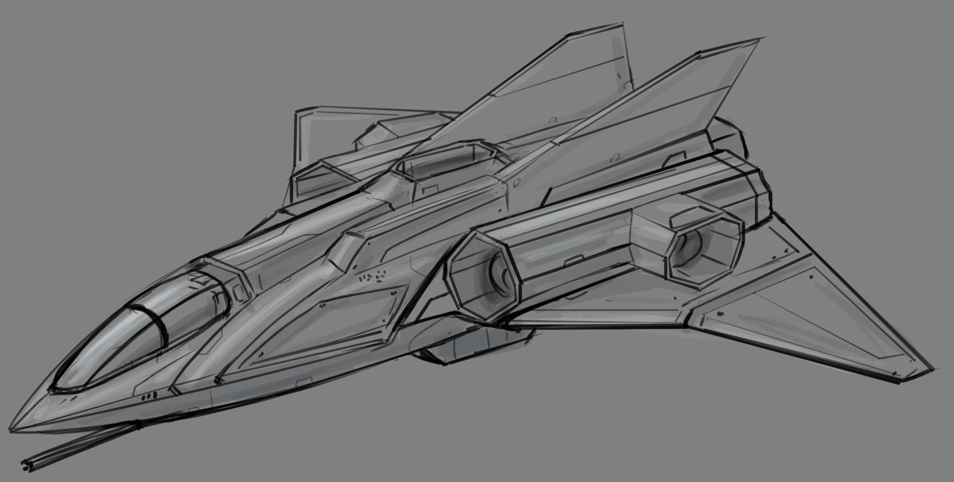
However, the first sketch was still looking too much like an atmospheric jet fighter:

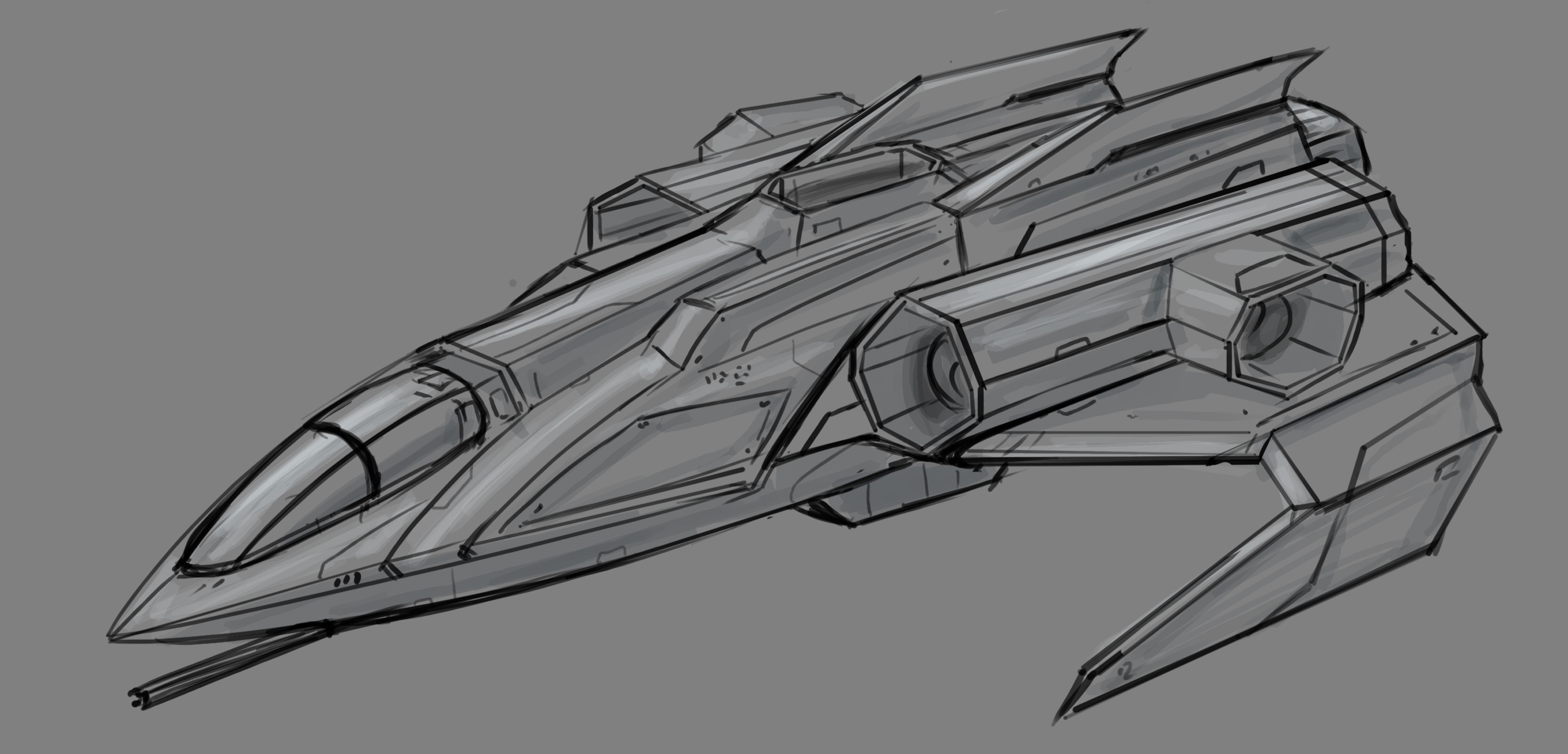
We liked that the fighter indeed had the more armored appearance, and it had thrusters for all directions, which supported our plan for its maneuverability. However, it was missing a few points; the biggest is - it has wings, and wings make no sense for a space-only vessel. We discussed that with the artist and asked to remove the wings as they do not fit our vision. Below, you can see the first revision:

Still not quite there. Yes, it looks much cooler now, but it still has wings. We thought that wings might make sense if they were used to carry equipment or armaments. Then, we looked at the model again and had an idea! Why not use the “wings” as protection plates for the thrusters? Right now, the main shaft is exposed. We can “sandwich” it between two metal plates. The fighter will still look cool, but now the shape has logic behind it.
We also discussed the cockpit and the canopy. Is there any reason for it to be transparent? Wouldn’t it make more sense that it is wholly armored and the pilot would use sensors and cameras to “see”?
Finally, we felt that the front of the fighter is still too round. As there is no need for the fighter to be aerodynamic, it makes sense to use more armor plating. We wanted its look to be more angled, similar to tanks with sloped armor.
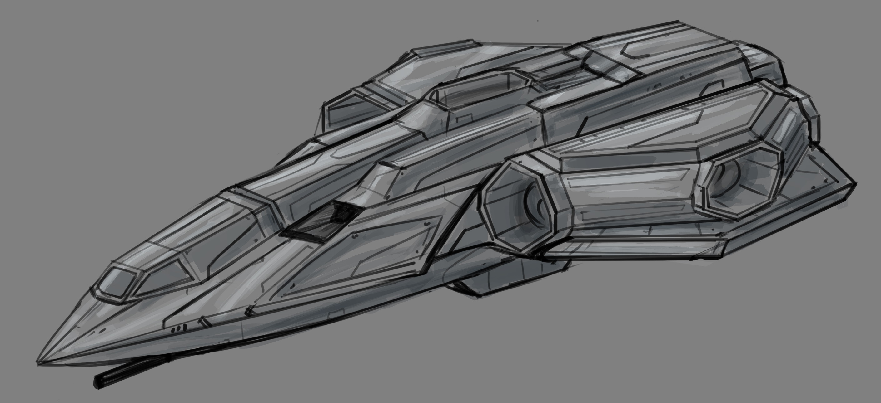
The second revision was much better:

Almost there! This sketch was much closer to what we imagined. The thrusters with armor plates were looking very good, but we agreed that the bottom plate needs to be the size and shape of the top plate. The canopy was mainly covered with armor plating beside a small section of armored glass. As we decided that the pilot doesn’t need any “direct” vision, we wanted to remove the windows and cover the entire canopy with armor plates. The front part of the fighter is more angled now for maximum armor effectivnes.
You might notice the part in the front that looks like an air intake and ask yourselves what the deal is. Obviously, we didn’t want to add an air intake on a spacecraft, but we wanted to add gyroscopic thrusters (small thrusters that the ship uses to spin, turn and pivot). Our idea was that very small nozzles will be located in key locations of the fighter.
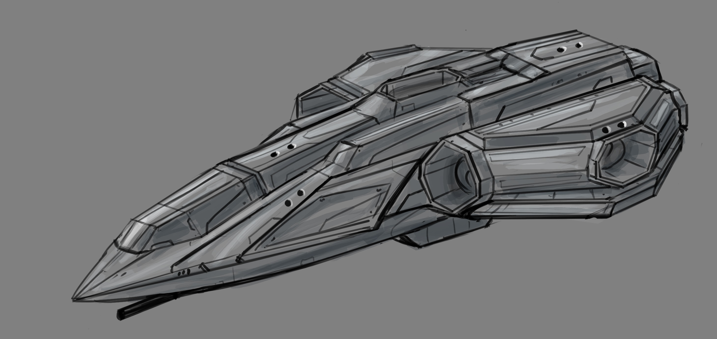
After relaying the above input, we got the final revision:

Behold the beauty! This revision was precisely what we wanted. The cockpit is fully armored now, the wings are looking good and the black dots around the fighter represents the gyroscopic thrusters.
However, this is just concept art, and now the real challenge will be to convert this drawing we love into a game-ready 3D model.